| Project: | Singapore Flyer, VIP Lounge & Ticketing Arena |
| Location: | Singapore |
| Area: | 80 m² |
| Status: | Proposed |
| Scope of Work: | Interior Design |
"Showcasing products creatively."
DESCRIPTION
Singapore Flyer is a established tourist attraction in Singapore. In its review of the existing functions, Straco Leisure has commissioned a design competition to address the areas of the Guest Lounge and a rethink of the ticketing area at the front entrance foyer.
CONCEPT
Our design concept was inspired by the iconic status the Flyer represents. Situated at a strategic location at Raffles Avenue, the Singapore Flyer showcases a unparalleled panoramic view of the city scape.
At the center of the Flyer was a lush oasis of flourishing plants and greenery. The central green space provided for a visual feast as much as a relaxing and tranquil back drop for shoppers to stroll around the open walkway at its peripheral.
We saw this green space as an much an icon as the Singapore Flyer. Our concept would be to bring this natural setting to the interior spaces of the Guest Lounge and the Ticketing area at the entrance foyer.
GUEST SERVICE LOUNGE
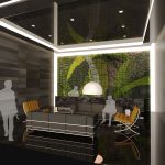
The space was for the purpose of providing a comfortable and classy area for waiting guests. A feature green wall fronts the reception and provides the perfect sense of arrival.
As an exclusive lounge, our design sought to provide a warm and intimate setting for these guests. The selection of materials, flooring, lights and furniture would be based on a bespoke palette of rich natural materials of marble, soothing lights and comfortable lounge furniture for the elite clientele.
TICKETING AREA AT ENTRANCE FOYER
The current space seemed similar to a transition space with ad-hoc shops serving a myriad of customers. From coffee to finger food, the customers would linger in this area as they await.
The central ticketing arena was a destination that the public went to for tickets for the flyer and associated recreational services offered at the flyer. It would also house all administration and offices within the space.
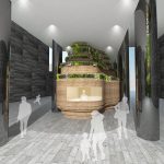
We proposed a central iconic ticketing booth that straddled the existing structural columns. Mirror cladding was proposed to the imposing structural columns. The ticketing booth was designed organically to reflect similar aspirations of blending with the green environment. The facade was tiered with staggering planter boxes that would allow plants to flourish.
The final design proposal was to allow the public to queue seamlessly, collect the tickets as well as await in the surrounding seats. The F&B outlets could still be located at the areas under the escalators to provide the necessary services for the guests.


